Background#
Back in the now-distant era of commuting everyday and spending a good part of the day attending meetings in office environment, one of the main pain-points on the company I was working with at the time was to ensure everyone at the office would commit to follow the meeting process flows, especially when it came to book a room or space for conferencing.
Multiple times would happen we were rushing to a meeting space just to find out someone else had it booked but didn’t properly communicate it. Our booking process for meeting rooms was broken, and needed some intervention in order to minimize impact on our daily routines.
Status and scope definition#
At the time, we were using a web-portal app that would pretty much work as a calendar, where everyone could login and create an event at a given location (meeting rooms or spaces). But more than often occurred that people would make mistakes while creating their reservation, being that the most common one was to switch which room they wanted to book.
The goal was to enable people to use something they already have at hand almost all the time, and with a glance they would be able to check the status of any space.
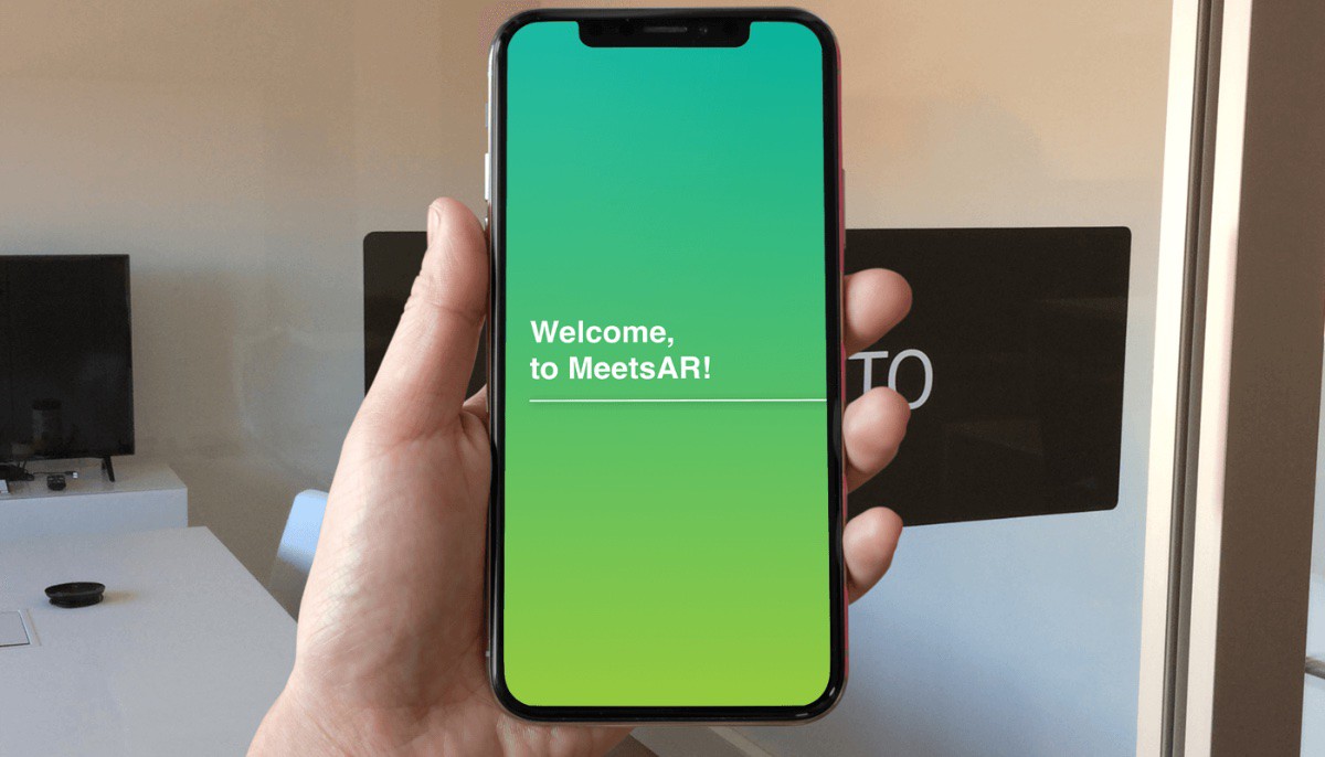
This concept app was thought out to serve as a means to use Augmented Reality to check availability and book meeting rooms inside an office.
Designing the experience and interfaces#
Here’s how the app would work: In this office all of the meeting rooms have unique names and icons associated with them. A person looking to find the schedule for a given room would simply point their device’s camera to the cutout vinyl image.
Using ARKit and image recognition as a way to identify the targeted location, information would be displayed on top of the user’s field of view, in context with real-world imaging.
Challenges and Obstacles#
With the overall user experience, the main focus was set around creating a quick and easy to use app, that would not distract people from the end-goal of accomplishing their query and moving forward to their tasks. The app was meant to be a companion for the office environment, and not a distraction that could impact their daily routines.
Regarding the UI, the main key aspect was to try keeping legibility of the displayed information on top of real world imaging as clear as possible. Using an opaque view overlaying the camera image would be easier, but the purpose was to provide a sense of lightness and transparency, while allowing the users to be aware of their surroundings.
The prototype and project conclusion#
The final prototype version of this app proved to work well enough, with a good number of people at the office responding positively to the contribute it brought to a better workflow.
Sadly, being an internal development project and not thought out to be a commercial product, the project came to a halt and was never properly finished and placed into everyday usage.
From a design perspective I consider this was a success, and a tool that would really prove valuable for people everyday. If at any point the opportunity presents again to transform this concept into reality (maybe even adapting it for other devices or media) it may well be converted into a real product that would be able to generate revenue, while facilitating everyday life for returning office workers or hybrid work companies.


